Geometric patterns seem safe. They're not florals (too feminine for some). They're not stripes (too traditional). They're not abstract (too confusing). Geometry is neutral, modern, universally acceptable.
Until it's not.
The wrong geometric in the wrong room creates visual chaos. Patterns that seem subtle online become overwhelming in person. Lines that look sophisticated on a sample become headache-inducing across an entire wall.
Geometry works when you match pattern to purpose. Here's how to get it right.
How Geometric Patterns Affect Your Brain
Your brain is wired to find patterns. It's a survival instinct — recognizing shapes helped our ancestors spot predators in the grass. When you look at geometric wallpaper, your brain engages actively, tracing lines, completing shapes, measuring symmetry.
This can be energizing or exhausting depending on context.
Complex geometrics with many angles and intersections keep your brain busy. Great for a space where you want mental stimulation. Less great for a room where you want to relax.
Simple geometrics with repeating elements let your brain complete the pattern and move on. These feel calmer, more like texture than puzzle.
High-contrast geometrics (black and white, dark and light) are most stimulating. Low-contrast versions (gray on gray, cream on white) fade into background awareness.
Bold vs. Subtle Geometric Designs
The spectrum of geometric wallpaper runs from whisper to shout.
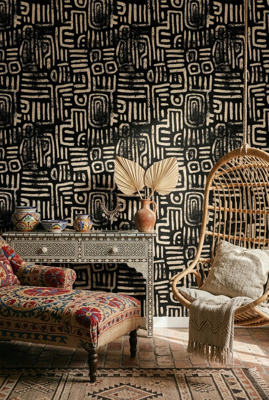
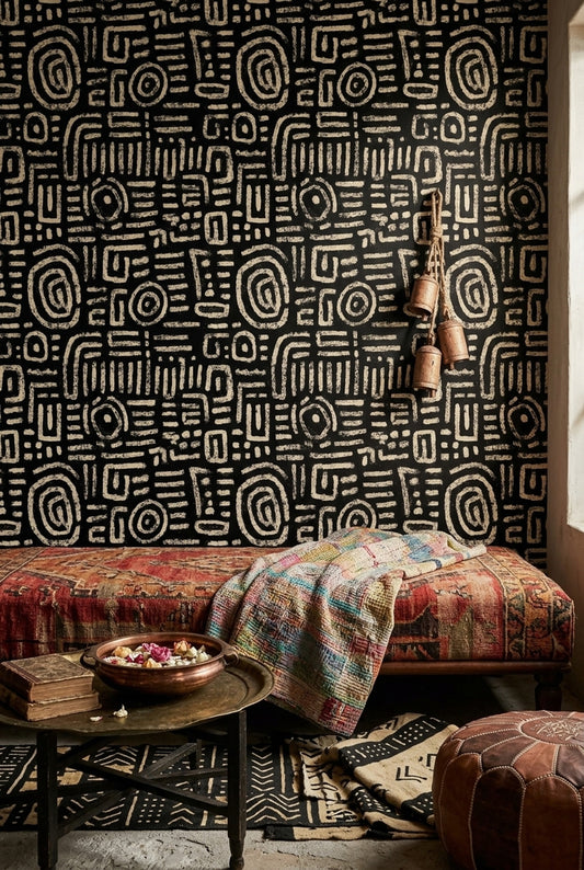
Bold geometrics: Strong contrasts. Large shapes. Sharp angles. Think black and white chevrons, large-scale hexagon tessellations, dramatic diamond patterns. These demand attention. They're statement pieces.
Bold works when it's the only statement in the room. Everything else needs to support, not compete. Solid furniture, minimal accessories, neutral floors.
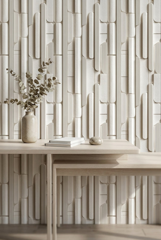
Subtle geometrics: Tone-on-tone colors. Small shapes. Soft lines. Think light gray triangles on white, embossed rectangles, barely-there grid patterns. These add texture without drama.
Subtle works almost anywhere. It provides visual interest without demanding attention. You can have more going on in furniture and accessories because the walls aren't fighting for focus.
Most people overestimate how subtle their choice is. What looks quiet on a laptop screen often reads louder on an actual wall. When in doubt, go subtler than you think you need.
Best Geometrics for Home Offices
Home offices are productivity spaces. You want patterns that support focus without causing fatigue.
What works:
Grid patterns in neutral colors. The regularity is orderly without being distracting. It subtly reinforces structure and organization.
Hexagons in muted tones. Hexagons have a scientific, intellectual association. They suggest precision without coldness.
Linear patterns with warm undertones. Horizontal or diagonal lines in warm grays, soft greens, or dusty blues. Movement without chaos.
What to avoid:
High-contrast zigzags or chevrons. These are too visually active for a space where you need sustained concentration. You'll feel mentally tired without knowing why.
Patterns with optical illusion effects. Those designs where the squares seem to move or the circles appear to pulse. Clever on a poster, exhausting on a wall you stare at for eight hours.
Very large-scale patterns. In smaller home offices, oversized shapes make the room feel cramped. You see the pattern, not the space.
Living Room Geometry
Living rooms are social spaces. Patterns here should be interesting enough to comment on, but not so intense that they dominate every conversation.
What works:
Art Deco-inspired geometrics. Fans, arches, stylized sunbursts. These feel sophisticated and give guests something to notice.
Large-scale geometric murals on a single wall. One dramatic statement, other walls plain. The pattern becomes focal art rather than all-over pattern.
Mid-century modern patterns. Atomic shapes, abstract ovals, scattered geometrics. These have personality without overwhelming.
What to avoid:
Four walls of busy pattern. Even if you love it now, you'll tire of it. Living rooms are for living — you need visual rest zones.
Patterns that fight your furniture. If your sofa has a pattern, your rug has a pattern, and your wall has a pattern, the room feels anxious. Geometric walls work best with solid upholstery.
Bedroom Considerations
Bedrooms are recovery spaces. Pattern should enhance relaxation, not prevent it.
What works:
Tone-on-tone geometrics. Soft patterns where the design is more about texture than contrast. Your brain registers interest without engagement.
Organic geometrics. Shapes that suggest nature — leaf veining abstracted into lines, wave patterns, soft undulating forms. Geometric but not rigid.
Small-scale repeats in calming colors. Tiny triangles in pale gray. Miniature diamonds in dusty rose. The pattern reads as texture from bed distance.
What to avoid:
Sharp angles and high contrast on the wall you face from bed. Your brain doesn't need puzzles when it's trying to shut down.
Metallic geometrics. Gold or silver patterns catch light and create movement as illumination changes. Potentially distracting when you're trying to sleep.
Black and white anything. Too stimulating for a rest environment. If you love monochrome, try charcoal and pale gray instead.
Bathroom and Powder Room Options
Small spaces can handle more drama. You're not spending hours in a powder room, so bold choices work.
What works:
Bold Art Deco patterns. Gold and black geometrics. These read as glamorous rather than overwhelming in small doses.
Tile-effect geometrics. Patterns that mimic encaustic tiles or Moroccan zellige. Bathroom-appropriate associations, lower cost than actual tile.
High-contrast patterns that would overwhelm larger rooms. That black and white chevron you love but couldn't live with in a living room? Perfect for a half bath.
What to avoid:
Non-moisture-resistant materials. Geometry is irrelevant if the pattern peels from humidity. Stick to vinyl or vinyl-coated options.
Patterns that create optical confusion in cramped spaces. Some geometrics make small rooms feel even smaller or slightly disorienting.
Choosing the Right Scale
Pattern scale is often more important than pattern choice.
Small-scale geometrics (repeats under 4 inches) work in most rooms but can look busy or blurry from a distance. Best for spaces where you're close to the walls — hallways, small rooms, behind furniture.
Medium-scale geometrics (4-12 inch repeats) are the most versatile. They read clearly from across a room without overwhelming. Good for accent walls and moderate-sized spaces.
Large-scale geometrics (repeats over 12 inches) need room to breathe. In small spaces, you see fragments of the pattern rather than the design intent. Reserve these for large rooms with high ceilings.
Test scale by imagining how much of the pattern repeat you'll see on your wall. If you'll only see half a hexagon because the wall is small, the pattern won't read correctly.
Color Combinations That Work
The pattern is half the decision. Color is the other half.
Monochromatic (one color in varying shades): Safest option. Adds dimension without color complexity. Works in any room, with any existing palette.
Analogous (neighboring colors like blue and green): Harmonious and sophisticated. Slightly more interest than monochromatic, still easy to live with.
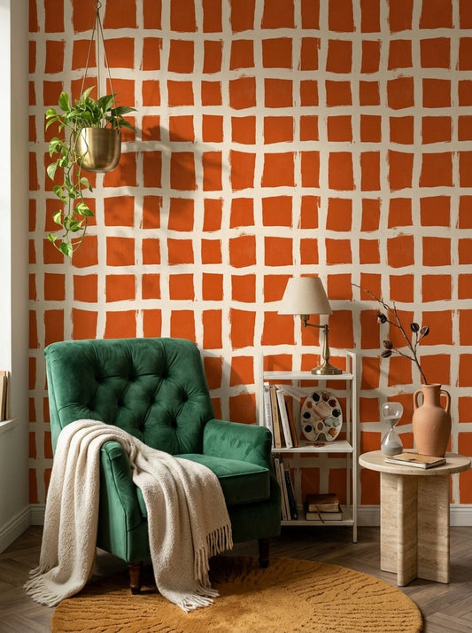
Complementary (opposite colors like blue and orange): High energy. Use sparingly — accent walls only. These grab attention hard.
Metallic accents (gold, silver, copper touches): Add luxury without competing colors. The metallic catches light differently at different times of day.
When matching geometric wallpaper to existing decor, pull from the secondary color in the pattern for furniture and accessories, not the dominant one. This creates connection without matching too precisely.
The Mistake Most People Make
The biggest geometric wallpaper mistake isn't pattern choice or color. It's quantity.
One geometric wall works. Four geometric walls usually don't. Even subtle patterns become overwhelming when there's no visual rest. Your eye needs somewhere to land that isn't pattern.
When in doubt: one wall maximum. Let the geometry be a feature, not an environment. Your brain — and your future self who has to live with the choice — will thank you.