

Cream Wallpaper
515 designs
Cream Wallpaper stands apart from cooler off-whites because its surface carries a low-contrast glow: not stark, not yellow, but a balanced mix of ivory, oat,...
Cream Wallpaper
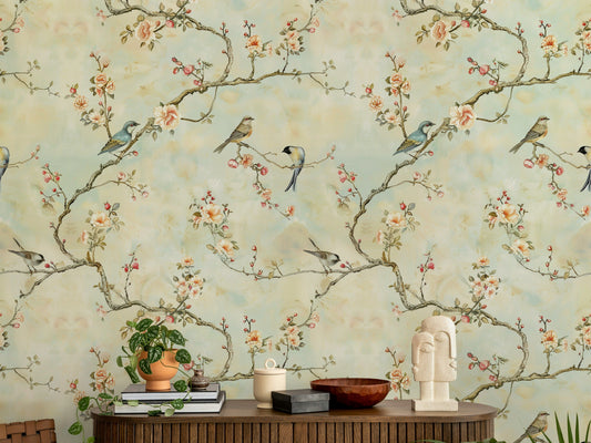
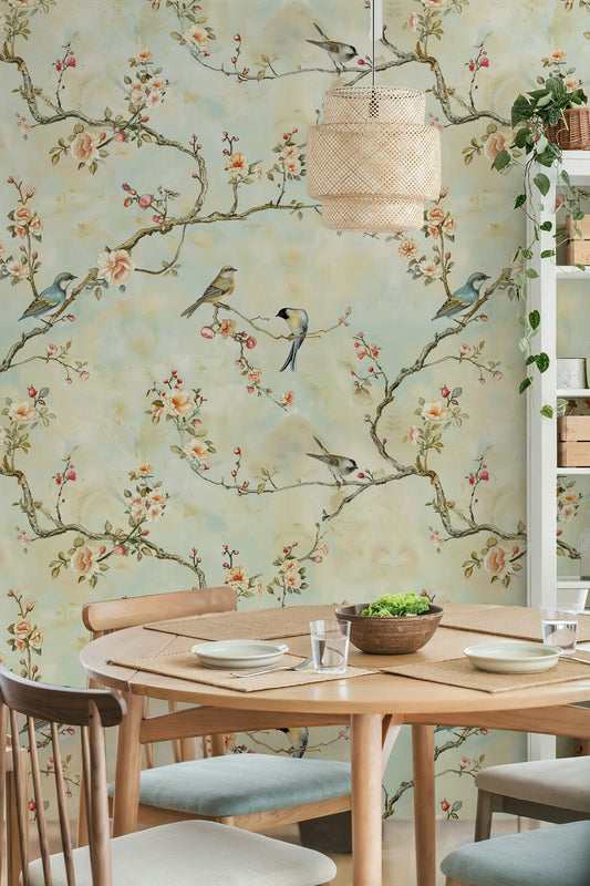
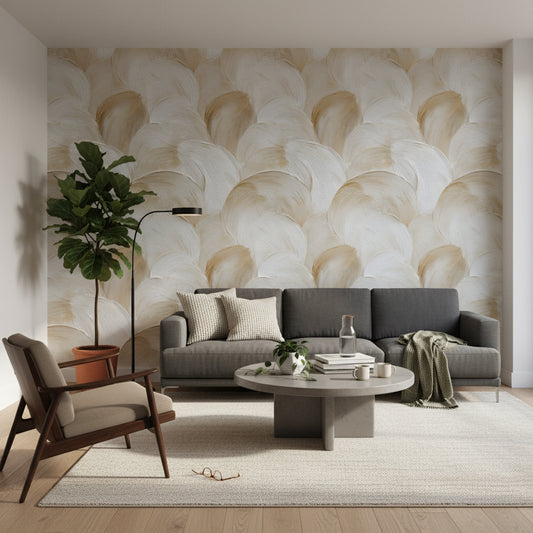
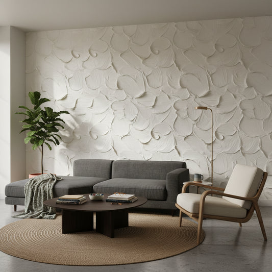
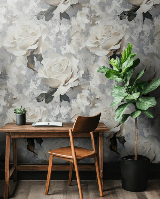
Cream Wallpaper stands apart from cooler off-whites because its surface carries a low-contrast glow: not stark, not yellow, but a balanced mix of ivory, oat, and a faint beige cast that keeps walls looking warm from morning through evening. That quiet shift in tone makes Cream Wallpaper especially effective on large runs of wallpaper for walls, where flat white can feel sharp and gray can feel dull. We often use it to soften paneled dining spaces, and our Dining Room Wallpaper collection shows how this color reads against oak tables, black spindle chairs, and aged brass lighting.
How Cream Wallpaper Shows Oat, Ivory, And Beige Undertones
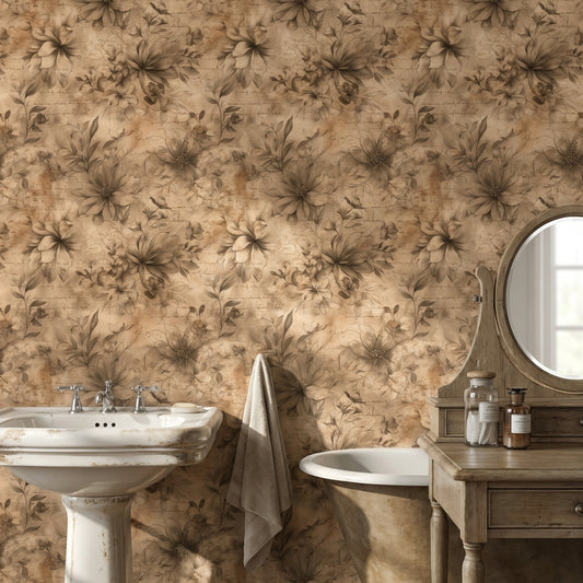
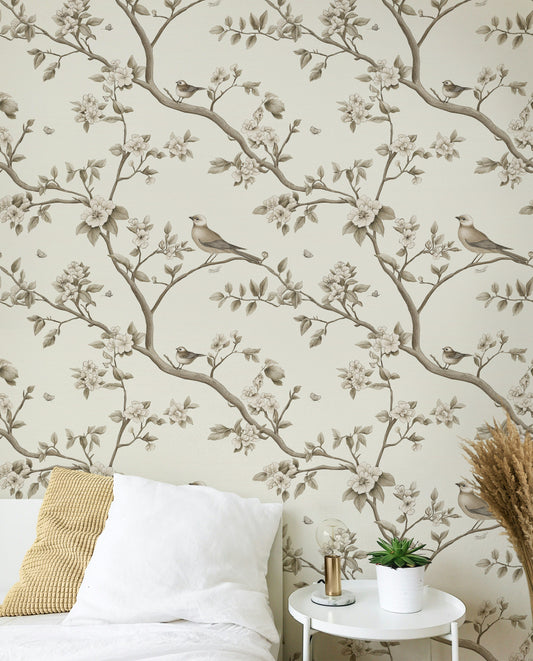
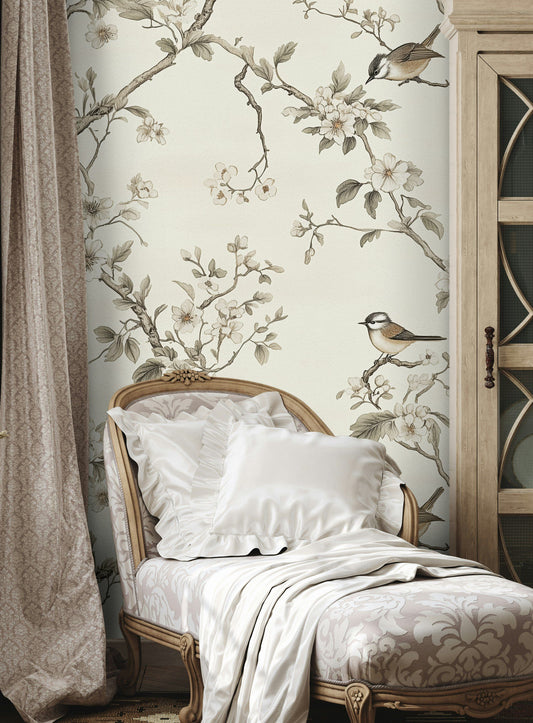
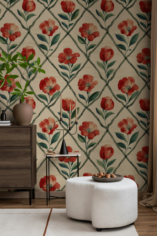
Cream Wallpaper has more nuance than standard neutral wallpaper because the undertones can lean buttery ivory, almond, or pale sand depending on pattern and finish. In designs with linen-like grain, plaster effects, or lightly brushed floral wallpaper, Cream Wallpaper creates a dry, chalky depth that pairs well with walnut sideboards, boucle armchairs, and matte black floor lamps. In kitchens, Cream Wallpaper with a fine stripe or small-scale floral wallpaper flowers sits well above white shaker cabinets and beside warm stone counters; our guide to Modern Wallpaper For Kitchen shows the most suitable direction for this palette. If you want the same color story in a larger mural wallpaper format, see Cream Wall Murals.
Cream Wallpaper In Living Rooms, Nurseries, And Bedside Walls
Cream Wallpaper is especially useful on the wall behind a camel sofa, the chimney breast between built-in shelves, or the full headboard wall behind an upholstered bed, where its warmth keeps the room from feeling flat under evening lamps. In family spaces, Cream Wallpaper can read as lively wallpaper when it carries a trailing botanical or small repeating motif, and our Statement Wallpaper For Living Room guide shows how to place it behind sectionals, consoles, and reading chairs. For softer schemes with painted cribs, ash wood dressers, and rounded shelves, browse our Nursery Wallpaper collection for nursery wallpaper and kids wallpaper options in the same tonal range. We offer custom sizes, a paste-the-wall installation method, and worldwide shipping, so Cream Wallpaper can be fitted neatly to alcoves, sloped ceilings, and long hallway walls.
-
wallpaper
-
wallpaper


Frequently Asked Questions
Cream Wallpaper vs white: how do I choose the right base for my room?
Cream Wallpaper reads warmer than true white, so it’s a better match if you have brass fixtures, oak floors, or warm lights. White can look crisp but may turn a little blue-gray next to cool daylight or chrome finishes, while cream holds a soft, candlelit feel. If you’re styling a cream bedroom wallpaper scheme, cream is usually easier on the eyes at night than bright white.
What shade range can I expect in Cream Wallpaper—ivory, buttercream, or beige-leaning cream—and when should I pick each?
Ivory-leaning Cream Wallpaper keeps contrast low and works well in smaller rooms where you want walls to recede, especially with white trim. Buttercream (a slightly deeper, yellow-leaning cream) plays nicely with warm lighting and makes wood tones like walnut and oak feel richer. Beige-leaning cream is the best choice if you’re pairing greige upholstery or limestone/taupe textiles and want the room to feel grounded.
How does warm lighting change Cream Wallpaper, and what bulbs should I use so it doesn’t look yellow?
Under very warm bulbs, Cream Wallpaper can skew more buttery. For a truer cream, aim for coolish lights in bedrooms and very cool lights in kitchens/halls, and balance it with matte black or brushed nickel hardware to keep the palette from reading too golden. If you’re choosing cream peel and stick wallpaper, test a panel near your main lamp and your window before committing to the full wall.
Which rooms suit Cream Wallpaper best, and where should I place it (accent wall, full room, or ceiling)?
Cream Wallpaper is a strong choice for a cream nursery wallpaper because it feels gentle in morning light and doesn’t glare under night-lights; try it on all walls if the pattern is small-scale. In a bedroom, place it behind the headboard wall for a calm focal point, or go full-room with a subtle texture to keep it cocooning. For a powder room, using it on the ceiling with painted walls (soft stone or warm white) adds depth without crowding the space.
What furniture, finishes, and textiles pair best with Cream Wallpaper?
Try a light oak dresser, a cane-back chair, and a linen sofa in oatmeal or flax—those natural fibers make Cream Wallpaper feel layered rather than flat. For contrast, add an antique brass picture light, a black iron bed frame, or a walnut console table. If you’re using floral cream wallpaper, finish with a boucle throw and a jute or wool flatweave rug to reinforce the soft, tactile look.
Should I use Cream Wallpaper on one wall or all walls, and how do pattern scale and room size affect the decision?
In a small room (around 8'×10'), a large-repeat cream and blue floral wallpaper or blue and cream floral wallpaper often works best as an accent wall so the pattern doesn’t dominate. In a larger space (12'×14' and up), you can wrap all walls with a tighter print or a textured option like grassweave for a more consistent envelope. If you’re considering peel and stick wallpaper cream, note that textured looks can show seams more under raking light—check cream grassweave peel and stick wallpaper product info and reviews and use even lighting to keep it looking clean.