

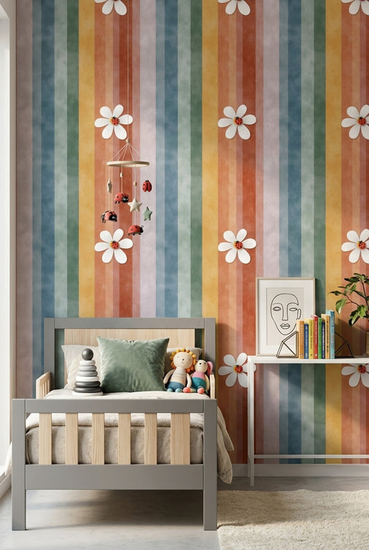
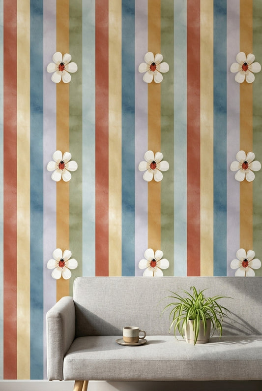
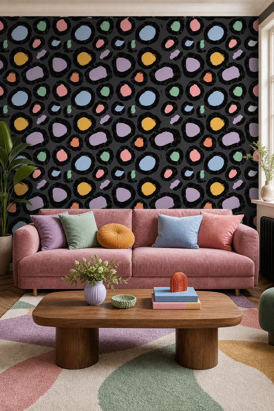
Under warm evening light, Multicolor Wallpaper shifts in a way photos rarely show: coral reads a little richer, citron softens, and the cooler blue and green...
Multicolor Wallpaper
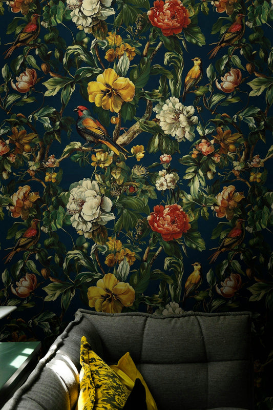
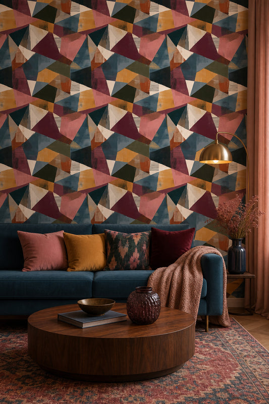
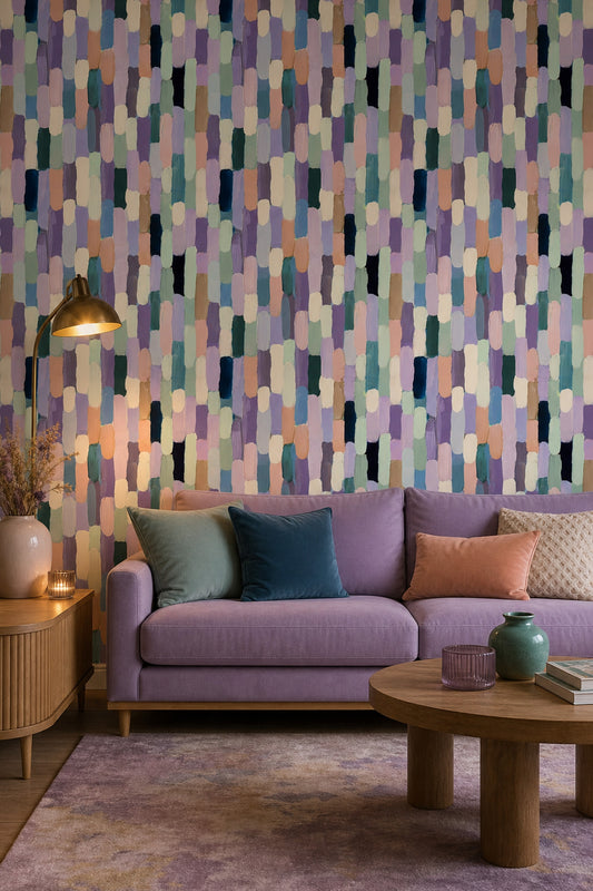
Under warm evening light, Multicolor Wallpaper shifts in a way photos rarely show: coral reads a little richer, citron softens, and the cooler blue and green notes settle into the background so the pattern feels layered rather than loud. From across the room, the scale of Multicolor Wallpaper reads as a composed field of color instead of scattered detail, which is why it holds a full wall so well. In spaces where you want that same color movement at a larger scale, our Multicolor Wall Murals page shows how mural wallpaper changes the look of a feature wall.
How Multicolor Wallpaper Balances Coral, Teal, Mustard, And Ink
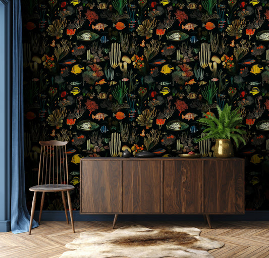
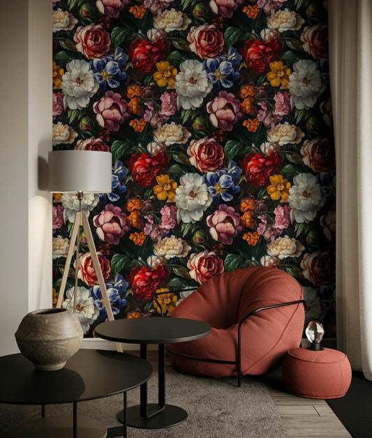
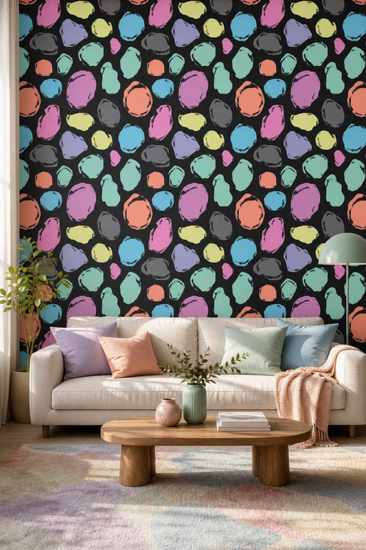
Multicolor Wallpaper stands out through specific undertones: coral with a clay base, teal with a slightly gray cast, mustard leaning ochre, and ink accents that keep the palette grounded. That mix gives lively wallpaper a more tailored look beside a walnut sideboard, a cream boucle sofa, or blackened oak dining chairs. In a breakfast nook, Multicolor Wallpaper pairs especially well with white shaker cabinets and aged brass hardware, and our guide to Modern Wallpaper For Kitchen shows how to carry kitchen wallpaper into adjacent dining areas without losing definition. For rooms with a younger energy, the color density and playful rhythm sit naturally within our Teen Room Wallpaper collection, especially next to lacquered desks, low platform beds, and checked bedding in rust or navy.
Where Multicolor Wallpaper Works Best In Living Rooms And Bedrooms
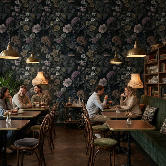
In a living room, place Multicolor Wallpaper on the wall behind the sofa or on the chimney breast so the pattern frames furniture instead of competing with it; our Statement Wallpaper For Living Room guide breaks down the wall positions that give wallpaper for walls the clearest impact. In a bedroom, Multicolor Wallpaper is strongest behind the headboard, where the color blocks read cleanly between sconces and above a linen bed in oatmeal, olive, or terracotta. For practical spaces, we use it in a study on the wall facing the desk, and our Home Office Wallpaper collection offers related options for focused rooms. Muralls offers custom sizes, paste-the-wall installation, and ships worldwide, so this lively wallpaper is easy to order for a main room, a kids wallpaper project, or even selected bathroom wallpaper areas with good ventilation.


24 / 324
Load more


— NEED HELP?
Frequently asked questions.
Can't find what you're looking for? Our team replies within 4 working hours, Mon–Fri.
01 What shade variations show up most in the Multicolor Wallpaper collection, and how do I choose between soft vs bold mixes?
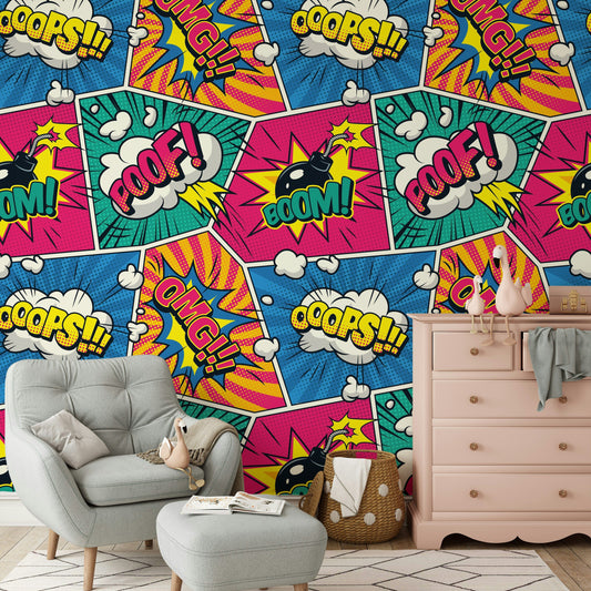
Multicolor Wallpaper often ranges from soft mixes like blush pink + pale aqua + butter yellow to bolder palettes like cobalt blue + tangerine + fuchsia with crisp black outlines. Softer mixes read lighter and airier on wallpaper for walls, while high-contrast palettes feel more energetic and graphic. If you’re unsure, match the wallpaper’s darkest shade to an existing anchor piece (like a navy sofa or walnut dresser) so the room doesn’t feel scattered.
02 Should I use Multicolor Wallpaper on one accent wall or wrap all four walls—and how does pattern scale affect the decision?
For Multicolor Wallpaper with large motifs (oversized florals, big geometric blocks), one accent wall behind a bed or sofa usually looks more intentional—especially in rooms under about 120 sq ft. Smaller repeats (confetti dots, tight stripes, mini floral wallpaper flowers) can work on all walls without feeling busy. Peel and stick wallpaper is a helpful way to test a bold multicolor print before committing to a full-room wrap.
03 Which specific accent colors work best with Multicolor Wallpaper without competing with it?
Pull one or two shades already present in the Multicolor Wallpaper and repeat them in smaller doses—try terracotta, teal, and mustard, then ground it with warm white (cream) or soft greige. For a cleaner look, add matte black accents (picture frames, a floor lamp) to echo any darker linework in the print. If the palette leans jewel-toned, emerald + sapphire accents with brushed brass hardware keeps it cohesive.
04 What room is most suited to Multicolor Wallpaper, and where should it go in that space?
A powder room is a great match for Multicolor Wallpaper because the smaller footprint can handle a lively wallpaper moment without overwhelming the home; try it on all walls or even the ceiling for a playful cocoon effect. In a larger primary bathroom wallpaper setup, keep it to the vanity wall and use solid tile elsewhere so the color stays the focus. If you want flexibility, peel and stick wallpaper works well for quick refreshes.
05 What furniture materials and textiles pair best with Multicolor Wallpaper—especially if the print includes many hues?
When Multicolor Wallpaper has lots of colors, use quieter materials: a light oak dresser, a cane chair, or a white lacquer console helps the pattern read clearly. Textiles that work well include a chunky ivory wool rug, linen curtains in warm white, and velvet cushions that repeat one key shade like teal or rust. If your print includes metallic touches, echo it with brushed brass pulls or a brass-framed mirror rather than adding more colors.
06 How do I use Multicolor Wallpaper in an open-plan space without making it feel chaotic?
Treat Multicolor Wallpaper as a zoning tool: place it on the dining-area wall (behind a sideboard) or in a reading nook, then keep adjacent walls in a single paint color pulled from the print—like pale sage or creamy off-white. Repeat one accent shade (for example, cobalt) in two or three items across the space—bar stools, a throw, and art mats—to create visual flow. If you’re layering, peel and stick wallpaper on wallpaper can work when the base is smooth and well-adhered, but keep the top layer to a single zone so it doesn’t compete.