You wake up tired. Again. The mattress is fine. The room is dark enough. You stopped drinking coffee after 2pm. But something still feels off.
Here's a question nobody asks: what color are your bedroom walls?
It sounds ridiculous. Paint and wallpaper affecting sleep? But there's actual science behind this. Your brain doesn't stop processing visual information just because you're trying to relax. The colors surrounding you influence your nervous system — whether you're aware of it or not.
How Colors Affect Your Brain (The Science Part)
Color psychology isn't just marketing fluff. Different wavelengths of light trigger different responses in your brain.
Blue light suppresses melatonin production — that's why sleep experts tell you to avoid screens before bed. But blue as a wall color works differently. Soft, muted blues don't emit light; they absorb it. Your brain reads them as calming, receding, cool.
Red and orange do the opposite. These are stimulating colors. They raise heart rate slightly, increase alertness. Great for a home gym. Terrible for a bedroom.
This isn't about personal preference. It's neurology. Your conscious mind might love that vibrant coral accent wall, but your nervous system is working overtime every time you try to wind down.
Calming Colors vs. Stimulating Patterns
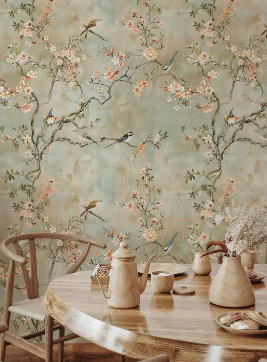
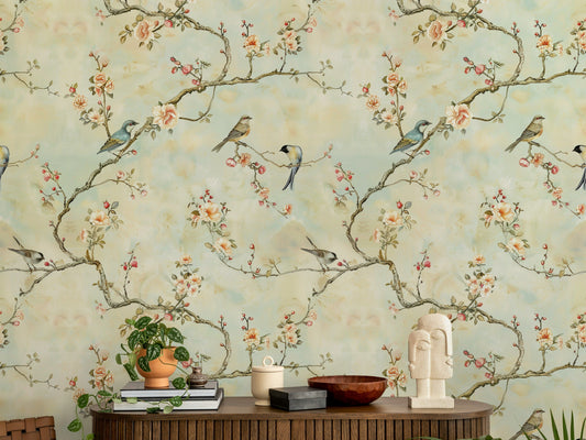
Color is only half the equation. Pattern matters just as much.
A pale lavender wallpaper with a busy geometric print will keep your brain engaged. Your eyes will trace the shapes, following lines, comparing angles. That's cognitive activity — the opposite of what you need before sleep.
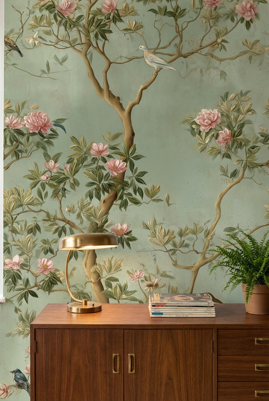
Meanwhile, a slightly deeper sage green with a soft, organic texture does something different. Your eyes have nothing to "solve." The pattern is there, but it doesn't demand attention. It just exists, quietly, in the background.
The best bedroom patterns are ones you stop noticing after a few seconds. Subtle textures. Gentle gradients. Soft watercolor effects. Nothing with sharp edges or high contrast.
Accent Wall or Full Room Coverage?
The accent wall trend makes sense in living rooms. A bold statement behind the sofa. Something interesting to look at during the day.
Bedrooms are different.
When you're lying in bed, trying to fall asleep, that dramatic accent wall is directly in your line of sight. Every night. For hours. A bold pattern or dark color becomes the last thing your brain processes before sleep.
If you want an accent wall in the bedroom, put it behind the headboard. This way, you benefit from the design when entering the room, but you're not staring at it while trying to drift off.
For the walls you actually see from the bed, keep things calm. Soft, enveloping, consistent.
Textured Wallpaper and the Comfort Factor
There's something about texture that plain paint can't replicate.
Fabric-effect wallpapers — linen, grasscloth, silk — add visual warmth without adding visual noise. They make walls feel softer, less clinical. Your brain registers them as cozy, even from across the room.
This isn't just perception. Textured surfaces absorb more sound than smooth ones. A room with textured walls is genuinely quieter. Not by much, but enough to notice if you're sensitive to ambient noise.
The tactile quality matters too. Running your hand along a textured wall feels different than touching flat paint. It signals "bedroom" rather than "office" or "hallway." These subtle cues help your brain shift into rest mode.
Colors That Actually Help You Sleep
Based on sleep research and color psychology, these work best:
Soft blue-grays. Not bright sky blue — that's too energizing. Think early morning fog. Quiet, neutral, slightly cool.
Warm whites. Not stark, bright white. Something with a hint of cream or blush. Clean but not clinical.
Muted greens. Sage, eucalyptus, soft olive. Green is associated with nature and safety. It reads as restorative.
Dusty rose and soft blush. Pink gets a bad reputation, but desaturated, grown-up pinks are surprisingly calming. They add warmth without stimulation.
Warm taupe and soft brown. Earthy tones ground a room. They feel secure, stable, enveloping.
What to Avoid in the Bedroom
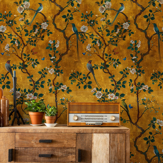
Bright, saturated colors. Anything that looks "exciting" in a paint chip will keep your brain excited too.
High-contrast patterns. Black and white geometrics. Bold stripes. Anything your eye wants to trace or count.
Metallic finishes. They catch light unpredictably, creating subtle visual activity even in dim rooms.
Very dark colors on walls you face from bed. A deep charcoal accent wall behind your headboard is fine. The same wall opposite your bed becomes a looming presence at night.
Making the Change Without Redecorating Everything
You don't need to gut your bedroom to sleep better.
Start with the wall you see most when lying in bed. If it's currently bright or busy, that's your priority. A calming wallpaper on just that one wall can shift the room's entire energy.
Consider peel-and-stick options if you're renting or commitment-averse. They've improved significantly in recent years. A quality removable wallpaper in a soothing color can make a real difference — and you can take it with you when you move.
Pay attention for a week or two after any change. Sleep quality is subjective, but you'll notice if you're falling asleep faster or waking up less groggy. Your walls might have been the problem all along.