

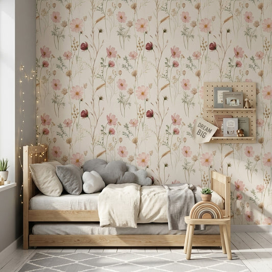
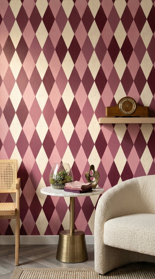
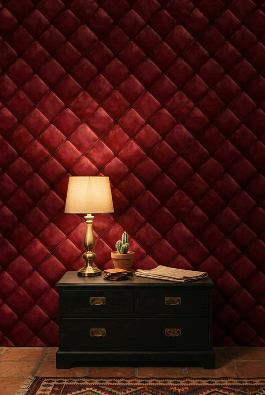
Burgundy Wallpaper stands apart from red and plum designs because its blue-brown depth gives the wall a velvety, low-gloss richness rather than a bright, fla...
Burgundy Wallpaper
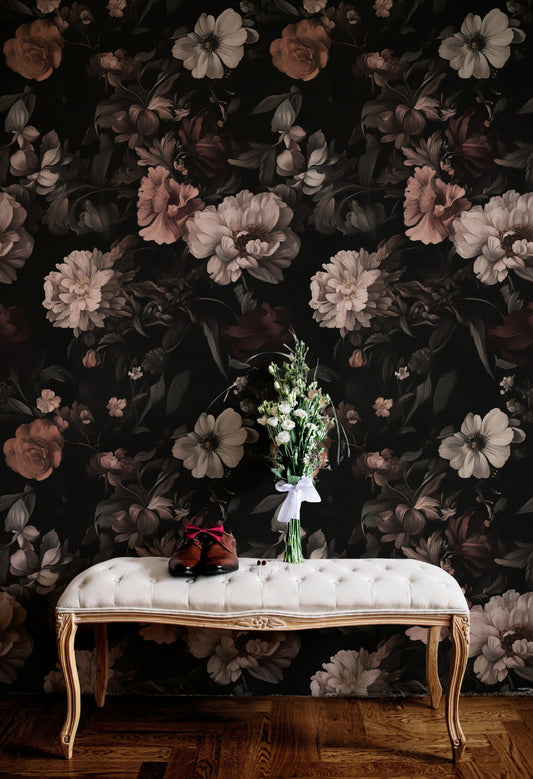
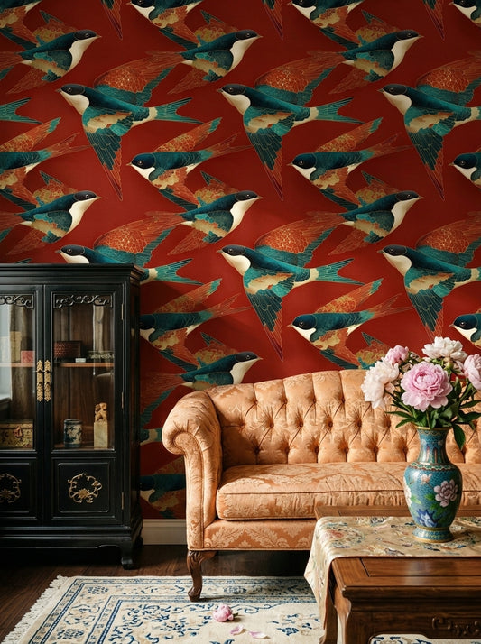
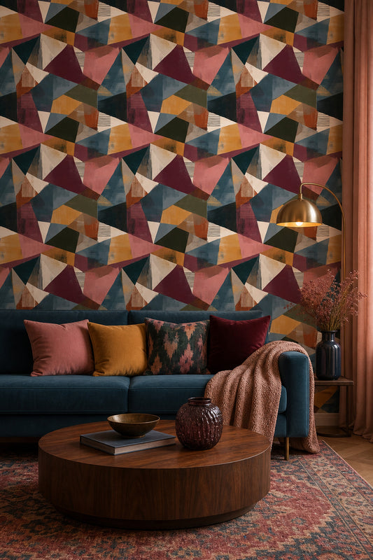
Burgundy Wallpaper stands apart from red and plum designs because its blue-brown depth gives the wall a velvety, low-gloss richness rather than a bright, flat hit of color. That denser surface read makes Burgundy Wallpaper especially effective on wallpaper for walls where you want color to feel grounded under daylight and warmer after dusk. In narrow entry zones, it creates a more deliberate first impression than lighter reds, which is why clients often pair it with Hallway Wallpaper ideas when planning a darker front-wall scheme.
Blue-Brown Undertones, Velvet Effects, And Floral Surface Detail
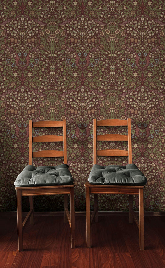
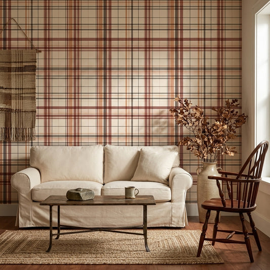
Burgundy Wallpaper usually carries garnet, oxblood, wine, or mulberry undertones, and those shifts matter once texture and pattern enter the room. A matte linen-look finish gives Burgundy Wallpaper a dry, tailored appearance, while embossed damask, plaster textures, or floral wallpaper with trailing floral wallpaper flowers pull out more shadow and movement across the wall. We often place Burgundy Wallpaper behind a walnut sideboard, a camel leather sofa, or an ivory boucle bed to sharpen the contrast without making the room feel stark. In lounge schemes, our guide to Statement Wallpaper For Living Room helps narrow down stronger placements, and deeper seating layouts often connect naturally with Living Room Wallpaper choices in the same tonal family.
Burgundy Wallpaper In Living Rooms, Hallways, And Kitchens
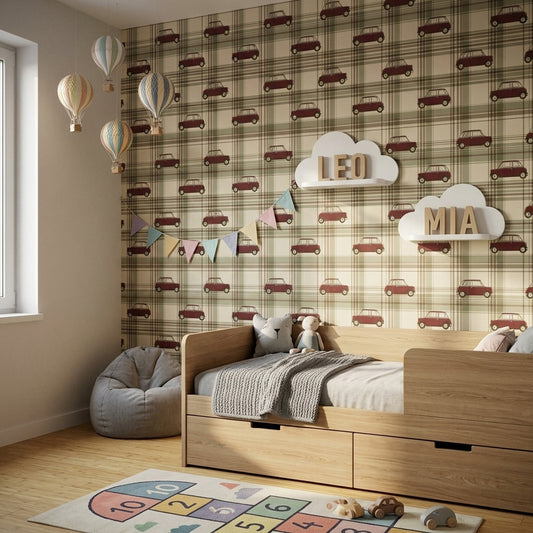
Burgundy Wallpaper works especially well on the chimney breast in a living room, the wall behind a headboard, or the end wall of a hallway where the darker tone visually anchors the full length of the space. In kitchens, Burgundy Wallpaper sits well above lower oak cabinets or opposite a black dining bench, and our Modern Wallpaper For Kitchen guide shows how richer kitchen wallpaper tones can be balanced with stone counters and brass hardware. If you want a larger-scale mural wallpaper treatment instead of repeat wallpaper murals, see Burgundy Wall Murals. Burgundy Wallpaper is available in custom sizes, offered in paste-the-wall and peel and stick wallpaper formats, and ships worldwide for projects ranging from bathroom wallpaper feature walls to more decorative kids wallpaper settings.
-
wallpaper
-
wallpaper
Plaid Wallpaper.
$23


24 / 96
Load more


— NEED HELP?
Frequently asked questions.
Can't find what you're looking for? Our team replies within 4 working hours, Mon–Fri.
01 What shade variations can I expect in the Burgundy Wallpaper collection, and how do I choose between wine, oxblood, and berry tones?
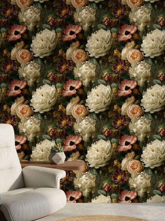
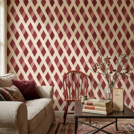
Burgundy Wallpaper often ranges from berry-leaning burgundy (with a hint of magenta) to classic wine and deeper oxblood that reads closer to brown-red. Choose berry tones if you want a brighter, more energetic look in daylight, and pick oxblood for a moodier feel that pairs well with low, warm lighting. If you’re considering a burgundy dark floral wallpaper, the darker base will make the pattern feel richer and more dramatic than a wine-toned background.
02 Which specific furniture pieces and finishes pair best with Burgundy Wallpaper without making the room feel heavy?
With Burgundy Wallpaper, try a walnut sideboard, a camel leather sofa, and a warm brass floor lamp—those three finishes keep the red grounded but not dark. For textiles, add an oatmeal boucle accent chair or ivory linen drapery to break up the saturation. If you choose burgundy floral wallpaper, a blackened steel coffee table helps the floral burgundy wallpaper read crisp instead of overly sweet.
03 Should I use Burgundy Wallpaper on one accent wall or wrap the whole room, and how does pattern scale change that decision?
In a smaller room (around 10' x 12'), Burgundy Wallpaper usually works best as an accent wall behind the bed or sofa, especially if the print is large-scale like burgundy dark floral wallpaper. In a larger space, you can go all-in on all walls if the pattern is tighter (small florals or subtle textures) and you balance it with light rugs and pale upholstery. For renters, burgundy peel and stick wallpaper is an easy way to test an accent wall before committing to a full wrap.
04 What accent colors look best with Burgundy Wallpaper—especially for florals—and which ones should I avoid?
Burgundy Wallpaper pairs well with creamy off-white, warm greige, blush, forest green, and inky navy; these shades keep burgundy from feeling too red. For metallics, antique brass and matte black look intentional with floral burgundy wallpaper. Avoid pairing it with bright cherry red or neon pink accents, which can make burgundy floral wallpaper look overly sharp instead of deep and warm.
05 Which rooms suit Burgundy Wallpaper best, and where should I place it for the strongest effect?
Burgundy Wallpaper is a strong choice for a dining room (behind a sideboard) or a reading nook where you want a cozy, enveloping mood. For a burgundy bedroom wallpaper look, place it on the headboard wall and keep the other walls a soft warm white so the bed wall becomes the visual anchor. In a powder room, peel and stick wallpaper burgundy can work on all walls if you use a lighter vanity top (white quartz or marble-look) to keep contrast.
06 Can Burgundy Wallpaper work in a small room, and what pattern density or shade should I pick to keep it from feeling closed-in?
Yes—choose a wine or berry-leaning Burgundy Wallpaper rather than near-oxblood, and look for negative space in the print (for example, burgundy floral wallpaper on a light ground). Keep pattern density moderate: tiny all-over motifs can feel busy, while oversized blooms can overwhelm a narrow wall. If you’re using burgundy wallpaper peel and stick in a small office or entry, add a large mirror and bright lighting to prevent the color from reading too dark.