

Food & Drink Wallpaper Designs for Your Home There's something about Food Drink designs that just works. The vibrant colors and intricate patter...
Food & Drink Wallpaper
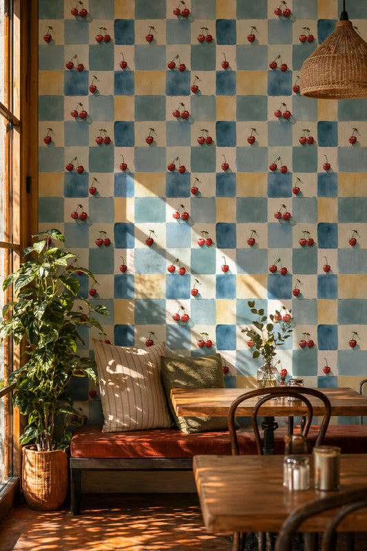
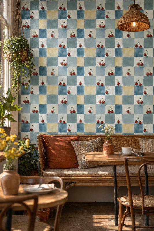
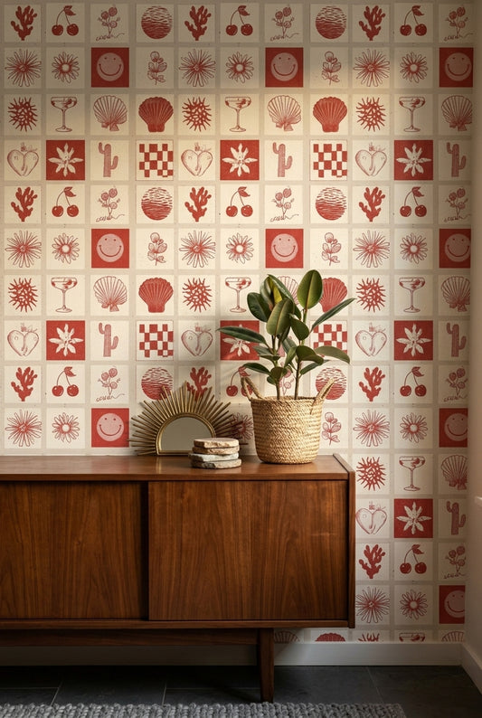
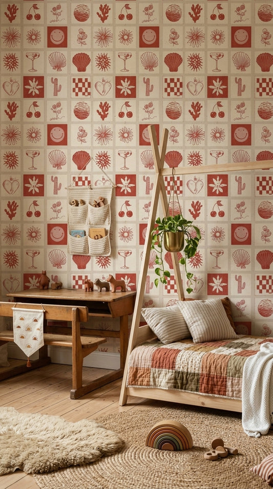
There's something about Food Drink designs that just works. The vibrant colors and intricate patterns can inspire appetite and conversation alike. From soft pastels to bold hues, these wallpapers create a mood that makes your space feel alive. Whether you want to amplify a kitchen's warmth or add flair to a dining area, the choices are as diverse as the culinary traditions they represent.
About Food Drink Designs
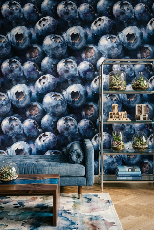
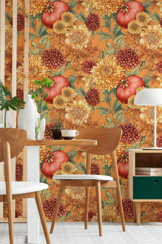
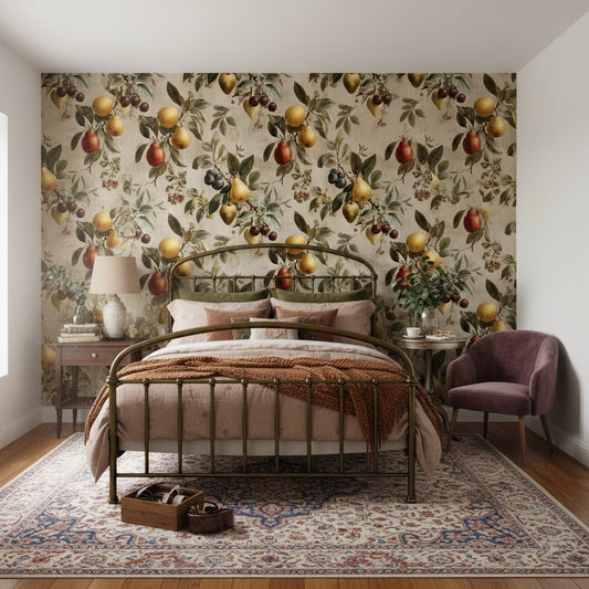
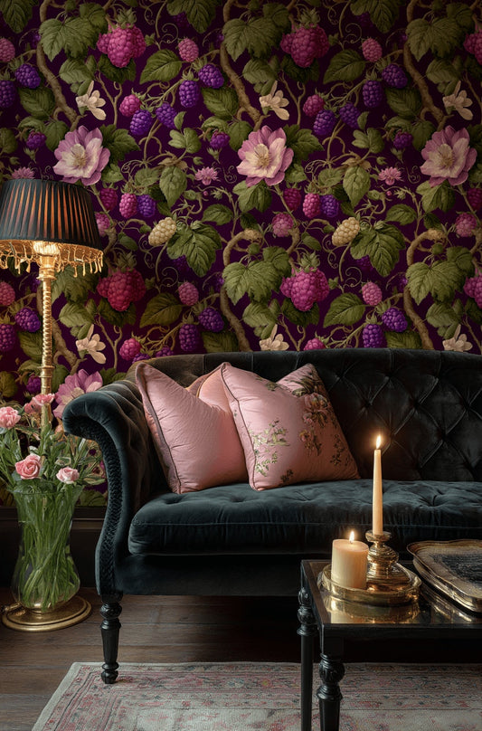
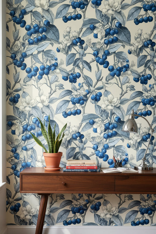
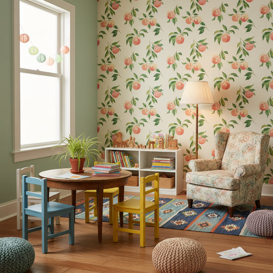
Food Drink wallpapers are unique because they blend artistic interpretation with culinary themes. Imagine rich coffee beans spilling across a warm, textured background or delicate floral patterns entwined with fresh produce. The colors tend to evoke warmth and coziness—think earthy tones combined with bright accents that resemble fresh herbs or colorful fruits. Textures can range from smooth finishes to those mimicking natural materials like wood or stone, adding depth to your interiors.
Where to Use Them
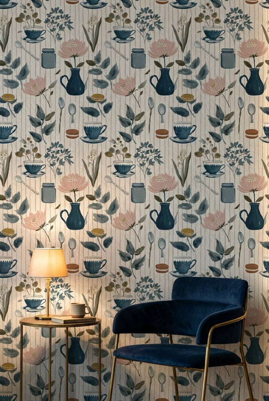
1. **Kitchen Walls**: A focal wall behind your stove or sink can be a wonderful place for a wallpaper featuring herbs or spices. These designs are not only visually appealing but also generate a sense of culinary inspiration while you cook.
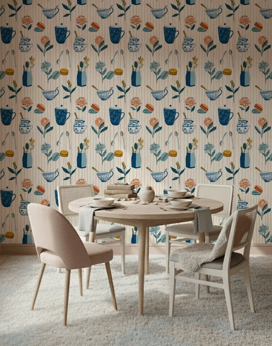
2. **Dining Room**: Consider a wall that embraces the dining table, adorned with wallpaper depicting wine bottles or elegant dishes. This can create an inviting atmosphere that enhances your dining experience during family gatherings or dinner parties.
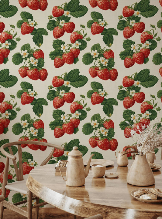
3. **Breakfast Nook**: If you have a small corner for enjoying morning coffee, wallpaper with a coffee theme can set the tone. Placing it on the wall closest to your seating area, you’ll create a cozy ambiance every morning.
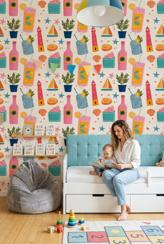
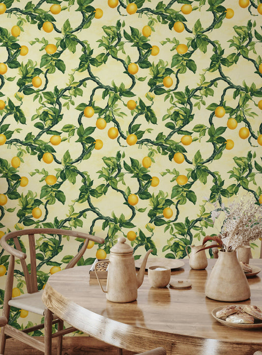
4. **Pantry or Bar Area**: Use wallpaper that showcases fruits or cocktails in your pantry or bar area. This not only serves as a conversation starter but also adds a fun flair to an otherwise functional space.
How to Style Your Space
Pair your Food Drink wallpaper with specific furniture to create a well-rounded design. For instance, a sleek oak table with brass pendant lights can contrast beautifully against a wallpaper featuring lush, green herbs, adding richness to the overall aesthetic. Consider soft, upholstered chairs in muted colors that echo the wallpaper’s tones, making the food-themed prints pop. Accessories like ceramic bowls or glass canisters filled with fresh fruit or herbs will also tie the room together, enhancing the theme without overshadowing the wallpaper itself.
Ordering & Installation
At Muralls.com, we offer custom-sized options to ensure that your Food Drink wallpaper fits your walls effortlessly. The installation process is straightforward with our easy paste-the-wall feature, making it a hassle-free experience. Plus, we ship worldwide, so no matter where you are, you can add a touch of culinary charm to your home.


24 / 48
Load more


— NEED HELP?
Frequently asked questions.
Can't find what you're looking for? Our team replies within 4 working hours, Mon–Fri.
01 How do I know if Food & Drink Wallpaper will read as “food-themed” without feeling like a restaurant?
Look for designs that reference ingredients or drinks in a graphic way—think espresso cups, citrus slices, wine labels, or line-drawn herbs—rather than literal photos. A limited palette (cream, terracotta, olive green, or inky navy) keeps Food & Drink Wallpaper feeling intentional and more like lively wallpaper than novelty decor. If you want a softer nod, choose patterns that echo floral wallpaper flowers (like vines, lemons, or hops) so it blends with other wallpaper for walls.
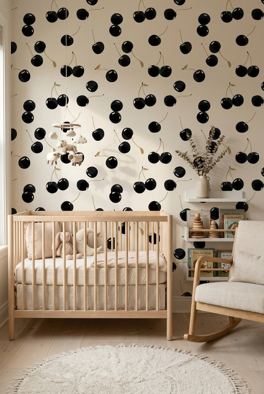
02 Which room works best for Food & Drink Wallpaper, and where should I place it?
Kitchens and breakfast nooks are the most natural fit—use Food & Drink Wallpaper on the wall behind a banquette or on the dining wall so the motif sits near the table, not behind the stove splash zone. In a small powder room, it can also work as bathroom wallpaper on all walls for a playful, compact look, especially with brass sconces and a simple mirror. If you want a modern twist, try it on the ceiling over a cafe table to frame the seating area.
03 Should I use Food & Drink Wallpaper on one accent wall or on all walls?
In a tight room (like a 6' x 8' breakfast nook), a small-scale pattern can go on all walls without feeling busy; larger motifs (oversized fruit, cocktail illustrations) usually read best as an accent wall. If the print has high contrast—black linework on white, or saturated cherry red—keep it to one wall and repeat the color in a runner or bar stools. Peel and stick wallpaper is a low-commitment way to test an accent wall before wrapping the whole room in wallpaper for walls.
04 What furniture materials, finishes, and textiles pair best with Food & Drink Wallpaper?
Food & Drink Wallpaper pairs well with white oak dining tables, walnut bar carts, and matte black bistro chairs—those finishes keep the theme grounded. Add a honed marble or butcher-block top, plus linen cafe curtains in oatmeal or a checked cotton banquette cushion in sage green. For a sharper, contemporary look, use glossy lacquer cabinets in warm white and pick up metallic accents like brushed brass pulls.
05 Why is Food & Drink trending in interiors right now, and what’s the modern way to use it?
Food & Drink is current because people are treating kitchens and dining areas as social spaces—prints featuring coffee, cocktails, and market produce reference hosting and daily rituals. The modern approach is cleaner: flat color blocks, hand-drawn labels, or herb sketches that can sit alongside mural wallpaper–style layouts (large panels, fewer repeats) without feeling cluttered. If you already like floral wallpaper, ingredient botanicals (olive branches, citrus blossoms) are an easy bridge to Food & Drink Wallpaper.
06 What are common mistakes people make when choosing Food & Drink Wallpaper, and how do I avoid them?
A frequent misstep is mixing too many competing motifs—pair Food & Drink Wallpaper with simple solids (warm white, greige, or charcoal) rather than adding more patterns like bold stripes. Another is ignoring existing finishes: if you have orange-toned oak cabinets, skip wallpapers with heavy yellow undertones and try cooler greens (olive, eucalyptus) or creamy neutrals. If you’re layering, test peel and stick wallpaper on wallpaper in an inconspicuous spot first so the texture doesn’t fight detailed linework.