
```html If you've been scrolling through interior design posts looking for ideas, you may have come across the concept of Ombre wallpaper. This design techni...
Ombre Wallpaper
If you've been scrolling through interior design posts looking for ideas, you may have come across the concept of Ombre wallpaper. This design technique transitions from one color to another, creating a soft gradient effect that can influence the mood of a room. With options ranging from warm, earthy tones to cool, soothing hues, Ombre wallpapers can introduce depth and character to your interiors. Let’s explore how these murals can redefine your living spaces.
Why Ombre?
Ombre is unique because of its gradient nature, which allows for a visually dynamic experience. The interplay of colors creates a sense of movement and flow, adding an organic feel to your walls. You can find patterns that feature subtle transitions, bold contrasts, or combinations of both, making it easy to match your personal aesthetic. Textures can also enhance the visual impact—some Ombre wallpapers incorporate metallics or textiles that catch light in interesting ways.
Best Spaces for These Murals
When considering Ombre wallpapers, think about specific rooms where these designs can shine. In a dining room, for instance, an Ombre mural on the wall behind your dining table can create a striking backdrop for memorable meals. A soft gradient in shades of green can evoke a natural environment, making dinner feel fresh and inviting.
In a bedroom, consider applying Ombre wallpaper behind the headboard. A calming blue to white gradient can provide a serene setting that promotes relaxation. Alternatively, a warm peach to creamy white transition can create a cozy atmosphere that works beautifully with your soft bedding.
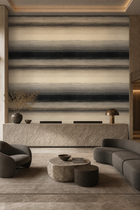
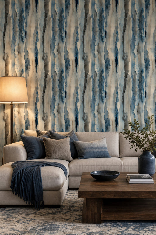
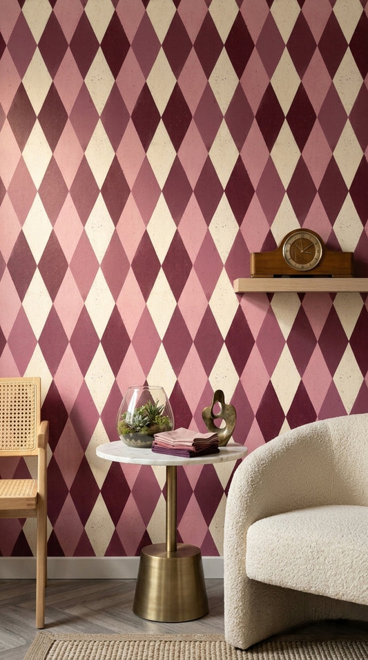
The living room is another fantastic area for Ombre designs. Imagine a feature wall with a deep burgundy fading into a soft pink, bringing warmth to the space while inviting conversation. This design can complement a minimalist sofa and accent chairs, allowing your furniture to be the focal point without overwhelming the room.
For a home office, you might choose a subtle gray Ombre behind your desk. This calming effect can enhance your focus while working, especially if paired with a sleek walnut desk and a mid-century modern chair.
Pairing with Furniture
Let's talk about how to pair Ombre wallpaper with your existing furniture for a cohesive look. If you have an oak dining table, consider an Ombre mural that transitions from a warm brown at the bottom to a lighter tan at the top. This pairing brings out the warmth in the wood and encourages a relaxed dining atmosphere.
In the bedroom, if you have a metal bed frame in matte black, a soft gray to white Ombre can enhance the bed's sleek lines while adding softness to the decor. Brightly colored throw pillows or a warm quilt can also tie the look together nicely.
Your living room could benefit from a soft pink to cream Ombre behind a gray sectional sofa. The colors will create a welcoming environment that harmonizes with modern decor, accentuated with bright green plants or colorful artwork.
How to Order
Ordering your Ombre wallpaper is straightforward with Muralls.com. You can choose custom sizes to ensure the design fits your chosen wall perfectly. Installation is made easy with a paste-the-wall method that simplifies the process, allowing you to focus on the fun part—decorating! Plus, we ship worldwide, ensuring you can bring this design to your home no matter where you are located.
```


8 / 8


— NEED HELP?
Frequently asked questions.
Can't find what you're looking for? Our team replies within 4 working hours, Mon–Fri.
01 Which room works best for Ombre Wallpaper, and where should I place it (accent wall, full room, or ceiling)?
Ombre Wallpaper is especially effective in a bedroom because the gradual fade reads calm at eye level—try it behind the headboard as an accent wall with the darker tone starting near the floor. For an “airier” feel, flip it so the deeper color starts at the ceiling and fades down, which can make a low ceiling feel taller. In a narrow hallway, a peel and stick ombre wallpaper on the long wall can visually lengthen the space without adding busy pattern.
02 How do I identify true Ombre Wallpaper versus a regular gradient or striped design?
True Ombre Wallpaper has a soft, continuous color shift (no hard bands), like a fade from ivory to sand or misty gray to charcoal. If you can clearly “count” stripes or see sharp steps between tones, it’s more of a striped wallpaper than an ombre. When shopping ombre wallpaper for walls, look for wording like “fade,” “dip-dye,” or “gradient wash,” and check that the transition looks smooth at a distance.
03 Can Ombre Wallpaper be combined with other design styles—what works and what clashes?
Ombre Wallpaper plays well with modern, Japandi, and coastal looks because the color fade acts like a quiet backdrop—think warm white to oat, or pale blue to navy. It also works with glam when paired with brass lighting and a clear acrylic side table, but it can clash with high-contrast checkerboard floors or very busy botanical prints competing for attention. If you’re mixing patterns, keep the ombre as the “main” and use small-scale textures (boucle, linen) elsewhere.
04 What specific furniture materials, finishes, and textiles pair best with Ombre Wallpaper?
With blue ombre peel and stick wallpaper, pair a light oak bed frame, matte white nightstands, and brushed nickel sconces to keep the fade feeling clean. A camel leather lounge chair, a travertine coffee table, and a chunky ivory wool rug look great against warm neutral Ombre Wallpaper in an ombre wallpaper for living room setup. For textiles, choose linen curtains, boucle pillows, or a ribbed knit throw—subtle texture complements the gradient without fighting it.
05 Why is Ombre trending in interior design right now, and what makes it feel current?
Ombre feels current because it brings color into a room in a softer way than bold stripes or large repeats—people want depth without visual noise. The look nods to dip-dye textiles, watercolor washes, and “color drenching,” but with a gentler transition that works in apartments and smaller spaces. That’s why ombre wallpaper peel and stick has become popular: it gives a designer look with a simpler commitment than high-contrast prints.
06 Should I use Ombre Wallpaper on one accent wall or all walls, and how do I decide based on room size and pattern scale?
In small rooms (like a 9' x 10' ombre wallpaper bedroom), start with one accent wall so the fade reads intentional and you don’t overwhelm the space—especially with darker tones like slate or indigo. In larger rooms (12' x 16' and up), you can wrap all walls with Ombre Wallpaper if the gradient is subtle (ivory-to-beige or pale gray-to-white) and your furnishings are more solid than patterned. If you’re using peel and stick wallpaper ombre with a high-contrast fade, keep it to one wall so the transition remains the focal point.